
The Ultimate Guide to Flyer Printing for Events: Sizes, Paper & Professional Tactics
Planning an event is a rush—until you realize you need to actually fill the room. While social media is a powerful engine, there is an undeniable staying power in physical media. A printed flyer lands in a hand, sits on a local cafe counter, or claims a spot on a community noticeboard. It stays in the “real world,” working for you long after a digital post has been buried by a fast-moving algorithm.
If you’ve never navigated the world of professional printing, the terminology can feel like a barrier. Between GSM, bleed zones, and finish types, it’s easy to feel overwhelmed. This guide simplifies the process, ensuring your first (or hundredth) print run looks exactly how you envisioned it.
Why Tangible Promotion Still Wins in a Digital Age
In an era of “scroll and forget,” flyers offers something digital ads cannot: physical permanence.
- Tactile Engagement: When someone holds a flyer, they are physically interacting with your brand.
- Localized Reach: For gigs, farmers’ markets, or community workshops, flyers hit the exact geographic radius where your potential attendees live and work.
- High Retention: A flyer can be pinned to a fridge or tucked into a bag as a physical reminder.
The most successful organizers use a hybrid approach: Digital for reach, print for presence.
Phase 1: Strategic Planning
The Information Architecture
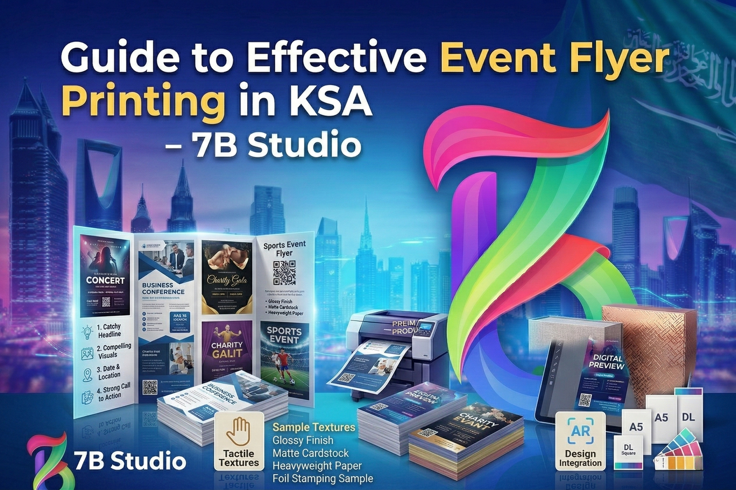
The biggest mistake in flyer design isn’t a bad font—it’s missing information. Before opening any design software, verify you have the “Big Five” finalized:
- What: The event name/headline.
- Where: The venue and address.
- When: Date and specific start/end times.
- Who: Performers, speakers, or the target audience.
- How: Clear instructions for tickets or registration (QR codes are excellent here).
Mastering Visual Hierarchy
Your flyer needs to communicate in layers. A viewer’s eye should hit the boldest headline first, followed by the date and location. Supporting details like social handles or sponsors should be the final layer. If everything is the same size, the viewer sees nothing.
Phase 2: Selecting the Perfect Dimensions
The size of your flyer dictates how people interact with it and where it can be displayed.
- A6 (Postcard Size): Best for high-volume hand-to-hand distribution. It fits perfectly in a pocket or a small bag.
- A5 (The Industry Standard): Half of a standard sheet of paper. This is the “sweet spot” for concerts and markets. It offers enough room for design without being cumbersome.
- A4 (Poster Style): Best for static displays. Use these for shop windows or community boards where they won’t be moved.
- DL (Slim/Envelope Size): Ideal for “passive pickup” locations like restaurant counters or hotel lobbies where they can stand upright in a rack.
Phase 3: Paper Weight & Texture (The EEAT Factor)
To demonstrate Experience and Expertise, you must understand how paper weight (measured in GSM) influences the Trustworthiness of your event.
Understanding GSM (Grams per Square Meter)
- 130–150 GSM: The professional baseline. It feels sturdy enough for street distribution without feeling like “cheap office paper.”
- 170–250 GSM: A mid-weight cardstock. It feels premium and won’t curl or wilt if left on a counter.
- 300+ GSM: Heavy cardstock. Reserved for VIP invitations or high-end gallery openings.
Coated vs. Uncoated
- Coated: Ink sits on top, making colors vivid and images sharp. Best for photography and high-energy graphics.
- Uncoated: Ink soaks in, giving a matte, organic, and “earthy” feel. Perfect for artisan markets, wellness retreats, or eco-conscious brands.
Phase 4: Finishes and Laminates
The finish is the “handshake” of your flyer. It’s the first thing someone feels.
- Gloss: High shine, high energy. Best for nightclubs and festivals.
- Matte: Non-reflective and sophisticated. Great for corporate events or exhibitions.
- Silk/Satin: The reliable middle ground. It has a subtle sheen that looks professional in any lighting.
- Soft-Touch: A luxury laminate that feels like velvet. Use this for events where the flyer itself is a souvenir.
Phase 5: Design Best Practices for Print
Use professional templates
Don’t reinvent the wheel. Tools like Canva or Adobe Express offer layouts designed by professionals who understand balance and spacing. Customize these rather than starting from a blank white box.
The “Two-Font” Rule
To keep your design clean, stick to two fonts: one for headlines and one for body text. Ensure the body text is a “Sans Serif” (like Arial or Helvetica) for maximum readability at smaller sizes.
CMYK vs. RGB
Your computer screen displays colors in RGB (light), but printers use CMYK (ink). Always set your design software to CMYK mode to ensure the “electric blue” on your screen doesn’t turn into a “muddy navy” on paper.
Bleed and Safe Zones
Always include a 3mm bleed (extra design area) around the edges. This ensures that if the printer’s blade slips by a fraction of a millimeter, you aren’t left with an ugly white sliver on the edge of your flyer.
Phase 6: Distribution Strategy
A stack of flyers in your trunk helps no one.
- Face-to-Face: Energy matters. A smile and a brief explanation make a person 5x more likely to keep the flyer.
- Strategic Partnerships: Leave flyers at businesses that share your target audience (e.g., a gym for a wellness event).
- The “Plus 10” Rule: Always order about 10–15% more than you think you need. It is significantly better to have a few left over than to run out during peak promotion.
Final Pro-Tip
A perfectly executed flyer is more than just paper; it is a physical handshake between your event and your community. To succeed, you must move beyond a simple design and focus on the strategic details. Start by establishing a clear visual hierarchy so your audience knows exactly where to look first. Choose a versatile A5 size on 150-170 GSM silk paper for a professional feel that commands respect without being overly bulky. Before you hit “print,” protect your investment by performing a rigorous proofread: read the text backward to catch spelling errors, double-check the date against the day of the week, and physically test your QR codes. By combining digital reach with the tangible authority of a well-printed flyer, you ensure your event doesn’t just exist online—it becomes a “can’t-miss” reality in the physical world.
Ready to transform your event promotion from a digital concept into a tangible success? Let the design and print specialists at 7bstudio craft a flawless, high-impact flyer that commands attention and guarantees a packed venue.
Frequently Asked Questions (FAQ)
1. Which size is truly the “best” for an event?
A5 (148mm × 210mm) is the industry standard. It’s portable, easy to hand out, and provides enough real estate for high-impact visuals and essential details.
2. What is the most reliable paper choice?
150–170 GSM silk-coated paper is the sweet spot. It feels substantial and professional, holds color beautifully, and lacks the distracting glare of a high-gloss finish.
3. Why is PDF the preferred format for printers?
A high-quality PDF “locks” your design elements. It ensures your fonts, high-resolution images, and layout remain exactly as you designed them, preventing errors at the print shop.
4. What happens if I forget the “bleed”?
Without a 3mm bleed, you risk having thin white slivers along the edges of your flyer if the printer’s cutting blade shifts slightly during the trimming process.
5. How many flyers should I actually order?
For local street distribution, 250–500 is a safe start. For larger regional events, 1,000+ is standard. Ordering in bulk significantly lowers your cost per flyer.
6. Can I just print these at home?
Home printers struggle with heavy paper and “full-bleed” (edge-to-edge) printing. To build trust and authority with the public, professional commercial printing is necessary.
7. Should I choose single or double-sided?
Single-sided is cost-effective for simple announcements. Double-sided is better if you have a lot of details (like a map or schedule) to avoid a cluttered front design.
8. How much time should I allow for the process?
Allow one full week. This provides 2–3 days for design and proofing, plus 3–5 days for professional production and delivery.
9. What is the difference between Gloss and Matte?
Gloss is shiny and makes colors pop—best for high-energy nightlife. Matte is non-reflective and sophisticated, making it better for text-heavy or upscale events.
10. How do I prevent my images from looking blurry?
Use images that are 300 DPI (dots per inch). Graphics saved from websites (72 DPI) will look pixelated and amateurish once printed on paper.
Post a Comment