
The Importance of Good Signage for Small Businesses — A Complete Guide for 2026
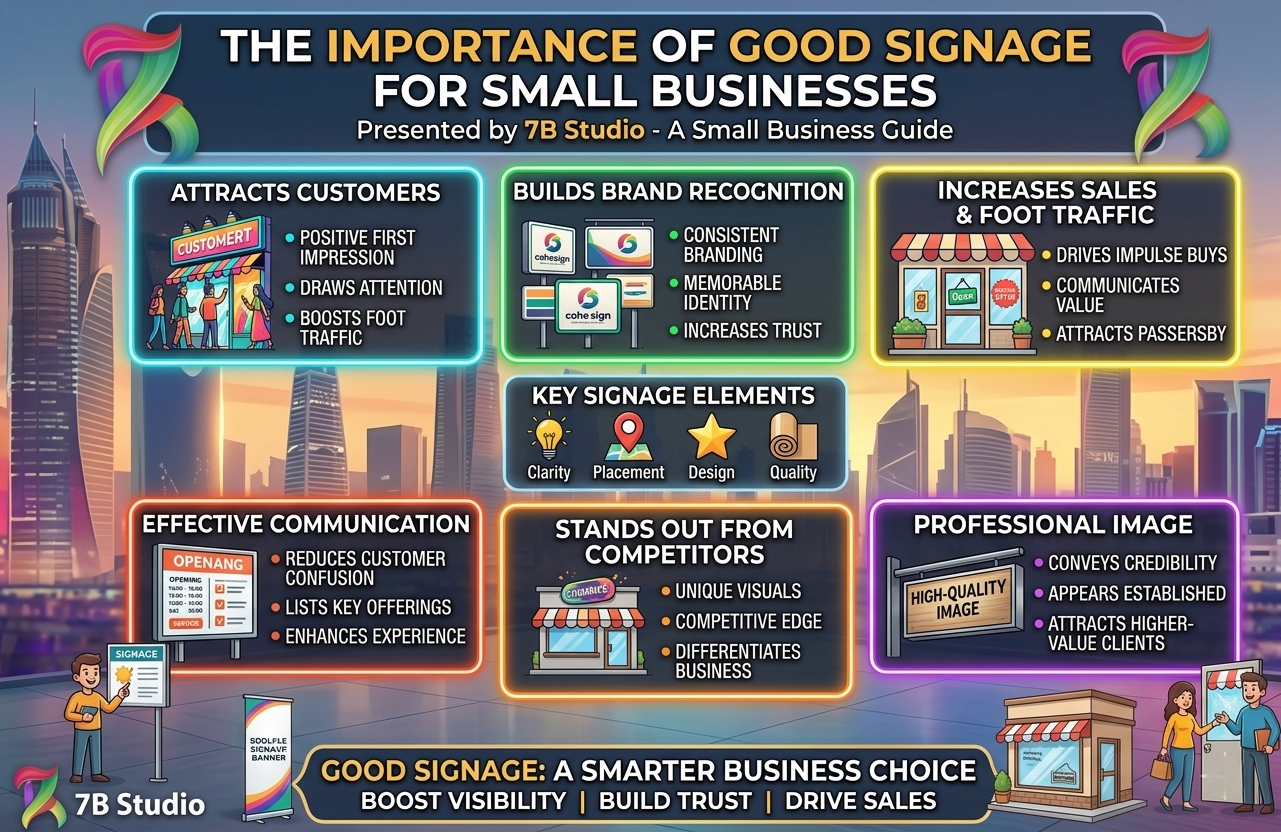
Understanding the true importance of good signage for small businesses is absolutely critical for physical retail survival in 2026. Long before a customer ever walks through your front door or speaks to your sales staff, your exterior graphics have already communicated your brand’s value. Consequently, ignoring this vital physical marketing asset guarantees that you will lose highly lucrative foot traffic to your direct competitors.
Furthermore, a faded, cracked, or poorly designed storefront marker actively damages your professional reputation in the local community. It subconsciously signals to potential buyers that your enterprise lacks attention to detail and financial stability. Therefore, mastering the visual elements of your physical location is the very first step toward building a highly profitable, recognizable local enterprise.
Understanding exactly what separates a mediocre display from a highly effective one requires analyzing the foundational elements of physical marketing.
What Is “Good Signage”? (And What Most Small Businesses Get Wrong)
Many local entrepreneurs mistakenly believe that simply putting their company name on a piece of plastic fulfills their physical marketing requirements. However, true visual communication requires a much deeper understanding of consumer psychology and environmental design.
The Difference Between a Sign and Effective Signage
A basic sign simply marks a physical location without offering any compelling reason for a consumer to enter the premises. It frequently features confusing typography, lacks brand consistency, and completely fails to stand out from the surrounding urban environment. Consequently, these basic markers act as invisible background noise rather than active, revenue-generating marketing tools.
Conversely, highly effective signage actively pulls the target demographic out of their daily routine and forces them to engage with your brand. It utilizes high-contrast colors, perfectly legible typography, and strategic placement to maximize visual impact from a significant distance. Therefore, effective visual communication actively solves a customer’s problem while simultaneously elevating your corporate identity.
Types of Signage Every Small Business Should Know
To maximize your physical presence, you must deploy a highly diversified portfolio of visual markers across your property. Relying on a single exterior marker severely limits your ability to guide and influence customer behavior. Successful local enterprises strategically utilize several distinct categories of visual communication:
- Exterior Identifiers: Massive storefront displays that capture attention from passing vehicular traffic.
- Wayfinding Markers: Internal directional plaques that guide customers effortlessly through your facility.
- Promotional Displays: Temporary sidewalk A-frames that highlight immediate, limited-time sales offers.
Understanding these different functional categories allows you to build a comprehensive visual strategy that guides the buyer’s journey perfectly. Furthermore, deploying the right type of marker at the exact right moment drastically reduces customer confusion.
Exploring the core financial and psychological benefits will completely change how you view these physical assets.
The Real Importance of Good Signage for Small Businesses
1. It Creates Your First Impression in Under 7 Seconds
Human beings process visual information incredibly quickly when scanning new urban environments or busy commercial shopping centers. Consequently, you literally have fewer than seven seconds to capture a pedestrian’s attention and communicate your primary value proposition. If your exterior graphics are confusing or difficult to read, that potential buyer will simply keep walking.
Furthermore, this rapid first impression permanently anchors the customer’s expectations regarding your pricing and service quality. A sleek, modern illuminated display instantly justifies premium pricing, while a handwritten banner suggests a discount, budget-friendly operation. Therefore, your physical markers dictate exactly what type of demographic walks through your front door.
2. It Works as 24/7 Silent Marketing
Unlike social media campaigns that disappear from a newsfeed within hours, your physical storefront communicates your brand continuously. It acts as a relentless, silent salesperson that actively pitches your enterprise 24 hours a day, 365 days a year. Even when your doors are securely locked at midnight, a properly illuminated exterior display continues building vital local brand awareness.
Additionally, this continuous exposure drastically lowers your overall customer acquisition costs over the long term. You only pay for the physical manufacturing and installation once, but you reap the marketing benefits daily for years. Consequently, it remains one of the highest-ROI marketing investments available to brick-and-mortar entrepreneurs.
3. It Drives Foot Traffic and Walk-In Customers
Strategic visual markers actively disrupt the daily commute of local pedestrians and impulsive vehicle drivers. By clearly advertising a compelling solution or a highly attractive promotion, you convert passing traffic into immediate, paying customers. Therefore, your exterior graphics act as a physical funnel that constantly feeds new leads directly into your sales environment.
Moreover, effective wayfinding graphics placed strategically near busy intersections can successfully redirect traffic toward your specific location. If your shop sits slightly off the main road, highly visible directional markers are absolutely mandatory for survival. They eliminate the frustrating friction of navigating confusing parking lots or complex commercial plazas.
4. It Builds Brand Identity and Trust
Consistent visual branding across all your physical assets builds deep, subconscious trust within your local community. When your exterior markers match your website, business cards, and interior decor perfectly, you project immense operational stability. Consequently, customers feel incredibly safe spending their hard-earned money with a highly organized, professional enterprise.
Conversely, a jarring disconnect between your sleek digital presence and a dilapidated physical storefront destroys consumer confidence instantly. Buyers naturally assume that if you neglect your physical appearance, you will likely neglect customer service as well. Therefore, treating your physical markers as a core extension of your brand identity is non-negotiable.
5. It Separates You From the Competition Next Door
In highly saturated commercial plazas, your direct competitors are often located literally right next door to your facility. Therefore, your exterior visual strategy must aggressively differentiate your brand from the surrounding visual clutter. Utilizing contrasting colors, unique dimensional lettering, or dynamic digital displays ensures your shop steals the spotlight.
Furthermore, this aggressive differentiation helps establish your enterprise as the definitive premium authority within your specific local niche. When your visual presentation vastly outshines the neighbor’s faded awning, customers automatically assume your products are vastly superior. Consequently, you win the crucial battle for walk-in traffic before the customer even sees the actual merchandise.
6. It Directly Impacts Your Revenue
The correlation between highly visible physical marketing and total gross revenue is an undeniable, mathematically proven reality. A significant percentage of daily retail sales are driven entirely by highly impulsive, unplanned walk-in visits. Therefore, an engaging exterior display directly captures these impulse buyers, immediately boosting your daily cash flow.
Additionally, poor visibility actively costs you money by making it incredibly difficult for highly motivated, pre-existing customers to actually find you. If a buyer cannot locate your facility within a few minutes, they will frequently abandon the trip and visit a competitor instead. Ensuring your location is aggressively marked protects your baseline revenue stream from frustrating navigational drop-offs.
7. It Communicates Professionalism Without Saying a Word
High-quality materials, such as laser-cut acrylic or brushed aluminum, subconsciously communicate immense corporate prestige and operational success. When a client approaches a facility adorned with these premium materials, they immediately expect a highly professional, white-glove service experience. Consequently, the physical texture of your graphics does the heavy lifting of establishing your corporate authority.
Furthermore, perfectly maintained graphics show the local community that you take immense pride in your commercial operation. Replacing burnt-out bulbs and washing dirty awnings demonstrates a high level of meticulous care that customers deeply appreciate. Therefore, treating your exterior graphics as a reflection of your internal operational standards is highly strategic.
Diving into the actual science behind these consumer reactions reveals exactly how to design better physical assets.
The Psychology Behind Why Signage Works
The human brain is hardwired to process bold visual imagery exponentially faster than it processes dense blocks of written text. Consequently, utilizing recognizable icons and high-contrast shapes allows your message to bypass the brain’s logical filters and trigger an immediate emotional response. This rapid cognitive processing is exactly why highway markers utilize universal symbols rather than long, descriptive paragraphs.
Furthermore, our eyes are naturally drawn to physical movement, bright illumination, and stark visual contrasts within our environment. By strategically utilizing illuminated channel letters or dynamic digital boards, you exploit these natural biological reflexes perfectly. Therefore, effective environmental design simply leverages human biology to capture and hold consumer attention.
Color Psychology in Business Signage
Specific color palettes trigger highly predictable emotional and physiological responses in the human brain. For example, vibrant red aggressively stimulates urgency and appetite, making it the undisputed champion for fast-food restaurants and clearance sales. Conversely, deep blue projects immense calm, security, and stability, making it the perfect choice for banks, corporate law firms, and medical clinics.
Additionally, selecting the correct contrasting background colors is absolutely vital for maximum long-distance legibility. Placing bright yellow text on a crisp black background creates an incredibly high-contrast ratio that the human eye can read from massive distances. Therefore, your brand colors must balance psychological impact with strict physical readability to succeed.
The Role of Fonts and Readability in Customer Perception
Highly intricate, decorative calligraphy might look beautiful on a digital screen, but it fails completely as an exterior commercial marker. The human brain struggles aggressively to decipher complex, looping typography when driving past a building at sixty kilometers per hour. Consequently, utilizing clean, heavy, sans-serif fonts guarantees that your primary message is absorbed instantly and effortlessly.
Furthermore, the physical weight and spacing of your typography subconsciously communicate your specific brand personality. A bold, thick font projects immense strength and industrial reliability, while a thin, elegant font whispers high-end luxury and exclusivity. Therefore, selecting the correct typography aligns your physical presence perfectly with your target demographic’s exact expectations.
Translating these psychological principles into actual physical hardware is the next critical step for your marketing strategy.
Types of Signage That Work Best for Small Businesses in 2026
Outdoor Storefront Signs
Your primary exterior identifier serves as the ultimate anchor for your entire physical marketing strategy. This massive installation must clearly state your company name and instantly convey exactly what products or services you provide. Consequently, illuminated channel letters or heavy dimensional acrylic logos are the undisputed industry standards for serious brick-and-mortar enterprises.
Furthermore, this primary marker must be strategically scaled to match the speed of the passing traffic outside your door. If your facility faces a high-speed highway, your typography must be massive to allow drivers adequate time to react. Therefore, correctly sizing your primary exterior marker prevents frustrated customers from driving past your facility.
Window Graphics and Decals
Massive, empty glass storefronts represent a massive, entirely wasted marketing opportunity for local retail enterprises. Applying high-quality perforated vinyl graphics allows you to advertise massive, full-color promotions while still allowing natural sunlight to enter your shop. Consequently, window decals provide an incredibly cost-effective method to transform blank glass into a highly aggressive, vibrant billboard.
Additionally, subtle frosted glass decals offer an elegant, sophisticated way to provide necessary privacy for medical clinics or high-end law offices. They allow you to proudly display your corporate logo and exact hours of operation without completely blocking the interior view. Therefore, utilizing your existing glass surfaces is a highly efficient way to maximize your marketing footprint.
Indoor Directional and Wayfinding Signs
Once a customer successfully enters your facility, their experience must be completely frictionless and highly intuitive. Utilizing clear, suspended directional markers guides them effortlessly toward specific product departments, checkout counters, and public restrooms. Consequently, effective internal navigation heavily reduces customer anxiety and prevents your sales staff from constantly answering basic directional questions.
Furthermore, these internal markers must strictly adhere to your established corporate visual identity and color palette. Utilizing cheap, handwritten paper notes taped to your walls instantly destroys the professional atmosphere you worked so hard to build outside. Therefore, investing in premium acrylic or brushed metal internal directional markers maintains your brand’s high-end prestige.
Digital and LED Signage
The rapid advancement of LED technology has made dynamic digital displays highly accessible for standard local enterprises. These incredibly bright digital boards allow you to rapidly change your marketing message, promote daily specials, and display vibrant video content instantly. Consequently, they completely eliminate the frustrating, recurring costs of physically reprinting massive outdoor vinyl banners every single month.
Moreover, the intense, dynamic movement of a digital display instantly captures the attention of distracted pedestrians and drivers. Even during the brightest daylight hours, modern LED panels cut through the visual clutter to deliver your message forcefully. Therefore, investing in digital technology essentially future-proofs your physical location against aggressive local competitors.
A-Frame and Sidewalk Signs
For businesses located in highly dense, pedestrian-heavy urban environments, the classic sidewalk A-frame remains an incredibly powerful tactical tool. These portable markers physically interrupt the walking path of potential customers, forcing them to look directly at your daily promotion. Consequently, they are absolutely ideal for cozy coffee shops, busy local restaurants, and boutique retail clothing stores.
Furthermore, the inherent flexibility of a chalkboard A-frame allows your staff to inject highly localized humor and daily personality into your marketing. A clever, handwritten daily joke or an aggressive flash-sale announcement creates an immediate, highly authentic connection with local pedestrians. Therefore, these cheap, portable assets frequently deliver the highest immediate return on investment for small retail shops.
Vehicle Wraps and Mobile Signage
Transforming your standard delivery vans or company cars into rolling mobile billboards exponentially increases your daily brand visibility. A professionally applied, full-color vinyl vehicle wrap advertises your services aggressively to thousands of local commuters every single day. Consequently, this highly mobile strategy allows you to capture valuable impressions far beyond your immediate physical neighborhood.
Additionally, parking a vibrantly wrapped company vehicle directly in front of your shop acts as an incredibly effective, temporary secondary marker. It immediately reinforces your brand presence and creates a massive visual footprint that passing traffic simply cannot ignore. Therefore, treating your corporate fleet as a core component of your visual strategy is a highly intelligent financial maneuver.
Executing these various formats correctly requires strict adherence to fundamental design principles.
What Makes a Sign “Good”? Key Elements of Effective Signage Design
Visibility: Can People Read It From a Distance?
The absolute most stunning graphic design in the world is completely useless if passing drivers cannot actually read it. You must ensure that your color contrast is incredibly high and that your chosen typography is thick and legible.
- The 10-to-1 Rule: For every 10 feet of viewing distance, your typography must be exactly one inch tall.
- High Contrast: Always pair a highly light color with an incredibly dark background to maximize visual pop.
- Whitespace: Leave massive amounts of empty space around your text so it does not look cramped or chaotic.
Furthermore, you must actively evaluate the physical environment surrounding your facility to identify potential visual obstructions. Ensure that overgrown trees, low-hanging power lines, or neighboring awnings do not physically block your expensive exterior marker. Therefore, aggressive visibility planning guarantees that your financial investment actually reaches the eyes of the consumer.
Clarity: Does It Communicate the Right Message Instantly?
A highly effective exterior marker must answer the customer’s primary question within three seconds: “What do you actually sell?” If your company name is highly abstract, you absolutely must include a clear, descriptive subtitle directly underneath the primary logo. Consequently, passing traffic will never have to confusingly guess what your specific commercial enterprise actually does.
Moreover, you must aggressively resist the urge to cram your entire operational history onto a single exterior marker. Trying to list every single service you provide creates a chaotic, unreadable mess that highly frustrates the passing viewer. Therefore, you must forcefully simplify your message down to a single, incredibly powerful core value proposition.
Brand Consistency: Does It Match Your Business Identity?
Your exterior graphics must serve as a seamless, physical continuation of your established digital website and printed marketing materials. Utilizing the exact same Pantone colors, specific corporate typography, and official logos builds massive, unwavering subconscious trust. Consequently, when a customer transitions from your Instagram page to your physical front door, the experience feels incredibly safe and predictable.
Furthermore, utilizing drastically different fonts or conflicting colors on your physical building creates massive cognitive friction for the buyer. It makes your enterprise look disorganized, chaotic, and highly unprofessional to the discerning local demographic. Therefore, strictly enforcing your corporate brand guidelines across all physical assets is absolutely mandatory for long-term success.
Lighting: Is Your Sign Working at Night Too?
If your facility remains open after the sun goes down, aggressive illumination is strictly non-negotiable for commercial survival. Utilizing modern, highly efficient internal LED modules ensures your corporate logo remains incredibly vibrant and visible throughout the darkest hours. Consequently, you continue capturing highly lucrative impulse buyers long after your unlit competitors have faded entirely into the shadows.
Additionally, even if your specific shop closes at five o’clock, leaving your exterior marker illuminated acts as a powerful 24-hour billboard. It continuously builds massive local brand awareness with evening commuters and late-night pedestrian traffic. Therefore, treating high-quality illumination as a mandatory marketing expense drastically extends the daily reach of your physical presence.
Placement: Are You Putting It Where Eyes Actually Go?
Installing a massive, highly expensive marker flat against a wall where nobody actually looks is a catastrophic financial mistake. You must meticulously study the natural traffic patterns, specific driving angles, and pedestrian walkways directly surrounding your commercial facility. Consequently, installing a projecting blade marker allows pedestrians walking parallel to your building to see your brand clearly from a massive distance.
Furthermore, ensuring your internal directional markers are hung at the optimal, natural eye level guarantees they are actually utilized. Hanging a crucial restroom plaque too high or placing a checkout marker too low creates massive, frustrating navigational friction for the customer. Therefore, strategic, highly logical placement is just as critical as the actual graphic design itself.
Unfortunately, many business owners learn these crucial design lessons the hard way by making highly avoidable errors.
7 Signage Mistakes Small Business Owners Make (And How to Avoid Them)
One of the most catastrophic mistakes local entrepreneurs make is treating their physical markers as a cheap afterthought rather than a core investment. They frequently attempt to design the graphics themselves using highly complex, unreadable calligraphy that completely destroys long-distance legibility. Furthermore, they cram far too much descriptive text onto the panel, turning what should be a rapid visual hook into an exhausting novel.
Another massive error is completely ignoring highly restrictive local municipal zoning laws and strict landlord regulations before manufacturing begins. Ordering a massive, illuminated LED board only to discover it violates city code results in thousands of wasted dollars and steep fines. Therefore, always secure the proper municipal permits, hire a professional commercial designer, and fiercely prioritize stark, high-contrast simplicity.
Avoiding these common pitfalls naturally leads to questions about the financial realities of commercial manufacturing.
Signage Cost Breakdown for Small Businesses
The total financial investment required for commercial graphics varies aggressively based on physical size, specific materials, and required illumination. A simple, non-illuminated acrylic lobby logo might cost a highly manageable 300 to 500 dollars. However, a massive, fully illuminated exterior channel letter system will easily range from 3,000 to over 8,000 dollars depending on the installation complexity.
Furthermore, you must accurately budget for necessary municipal permit fees, professional graphic design services, and specialized bucket-truck installation labor. Attempting to cut corners by hiring an unlicensed installer to hang a massive exterior marker is a massive, dangerous liability. Therefore, viewing these upfront costs as a mandatory, long-term capital investment is crucial for accurate budget planning.
How to Calculate the Return on Your Signage Investment
Unlike complex digital advertising campaigns that require constant monthly funding, a physical exterior marker represents a one-time capital expenditure. If a 5,000-dollar illuminated display lasts for a standard ten years, your actual amortized marketing cost is roughly 1.30 dollars per day. Consequently, if that massive display brings in just one extra customer per week, the asset pays for itself incredibly quickly.
Additionally, you can effectively measure this specific return on investment by surveying new walk-in customers regarding how they found you. Tracking the noticeable spike in daily foot traffic immediately following the installation of a new exterior marker provides undeniable mathematical proof. Therefore, upgrading your physical presence is universally considered one of the safest, highest-yielding investments a local business can make.
Interestingly, this highly physical offline asset actually possesses a massive impact on your digital visibility as well.
Good Signage and Local SEO: The Offline-Online Connection You’re Missing
Modern consumers frequently utilize their smartphones to navigate local neighborhoods while simultaneously searching for specific products and services online. When your massive, highly visible exterior marker catches their eye, they instantly search for your exact brand name on Google Maps. Consequently, aggressive physical visibility directly triggers highly valuable, exact-match brand searches that heavily boost your local SEO rankings.
Furthermore, an incredibly aesthetic, highly creative exterior display actively encourages pedestrians to take photos and post them on social media. When customers tag your specific physical location on Instagram or Facebook, it creates massive, free digital backlinks to your local business profile. Therefore, viewing your physical storefront as a powerful, offline catalyst for digital engagement is a highly advanced, incredibly lucrative marketing strategy.
Translating this advanced strategy into reality requires following a highly structured implementation plan.
How to Get Started: Improving Your Small Business Signage in 2026
Step 1 — Audit Your Current Signage
Begin the process by walking completely across the street and viewing your commercial facility exactly as a new customer would. Honestly evaluate if your current exterior graphics are faded, if the LED bulbs are burnt out, or if the typography is difficult to read. Consequently, this brutal visual audit will immediately expose the critical weak points actively costing you daily foot traffic.
Furthermore, take detailed photographs of your direct competitors’ physical storefronts within your immediate commercial plaza. Analyze exactly why their exterior graphics might capture more attention than your current setup. Therefore, understanding your local visual competition dictates exactly how aggressive your new physical upgrade must be.
Step 2 — Define Your Brand Message
Before speaking to a commercial manufacturer, you must aggressively distill your entire corporate identity down to a single, powerful message. Determine exactly what core emotion or specific primary service you want passing traffic to associate with your physical building immediately. Consequently, this intense focus prevents you from cramming unnecessary, confusing information onto your expensive new acrylic panels.
Moreover, ensure you have all your high-resolution corporate logos, exact Pantone color codes, and specific typography files perfectly organized. Providing a disorganized manufacturer with a blurry JPEG logo guarantees a highly pixelated, deeply unprofessional final installation. Therefore, flawless digital preparation is the ultimate key to flawless physical execution.
Step 3 — Choose the Right Sign Type for Your Location
Analyze the specific physical constraints, traffic patterns, and lighting conditions directly surrounding your commercial facility. If your shop is hidden deeply inside a dark alleyway, investing heavily in a massive, projecting illuminated blade marker is absolutely mandatory. Consequently, matching the specific hardware to the exact environmental challenges guarantees maximum visual impact.
Furthermore, meticulously review your specific commercial lease agreement and local municipal zoning laws before making any final decisions. Ensure you are actually legally permitted to install illuminated channel letters or dynamic digital LED boards on the exterior facade. Therefore, conducting strict legal due diligence prevents catastrophic financial losses and forced removals.
Step 4 — Work With a Professional Designer or Signage Company
Never attempt to design massive commercial exterior graphics using basic consumer software or cheap online templates. You absolutely must partner with a highly experienced commercial vendor who thoroughly understands complex manufacturing tolerances, structural wind loads, and long-distance legibility. Consequently, a professional will ensure your vision translates perfectly from the digital screen to the physical building.
Additionally, demand to see physical material samples of the specific brushed aluminum, routed acrylic, or vinyl wraps they intend to utilize. Holding the physical materials ensures you are entirely comfortable with the tactile quality representing your corporate brand. Therefore, treating your commercial manufacturer as a strategic, highly collaborative partner guarantees a vastly superior final product.
Step 5 — Test, Measure, and Improve
Once your massive new exterior display is finally installed, you must actively track the immediate impact on your daily walk-in traffic. Train your internal sales staff to constantly ask new clients exactly how they discovered your physical facility. Consequently, this strict data collection provides undeniable mathematical proof of the upgrade’s massive return on investment.
Furthermore, do not hesitate to continuously optimize your secondary, temporary visual assets based on seasonal changes. Regularly update your sidewalk A-frames and interior promotional window decals to keep the physical presentation looking fresh and highly energetic. Therefore, treating your physical marketing as a dynamic, constantly evolving strategy maximizes long-term revenue.
The cost of inaction on this front is simply too high for modern local enterprises to ignore.
Final Thoughts: Don’t Let Poor Signage Cost You Customers
Mastering the importance of good signage for small businesses is ultimately about removing every possible point of friction between the consumer and your front door. If your physical facility looks faded, confusing, or highly unprofessional from the street, you are actively driving lucrative revenue directly to your competitors. Consequently, upgrading your visual presentation is not a frivolous luxury; it is a strict, undeniable requirement for commercial survival in 2026.
By investing heavily in high-contrast typography, brilliant LED illumination, and premium physical materials, you instantly elevate your entire corporate prestige. Your exterior graphics will continue working relentlessly as your most reliable, 24-hour silent salesperson for years to come. Therefore, take complete control of your physical marketing today and ensure your building speaks highly of your brand before you ever say a word.
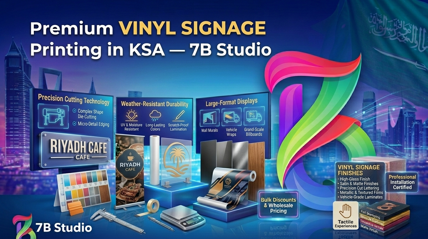
Ready to dominate your local market with stunning, high-impact exterior graphics? Let the expert design team at 7b studio create flawless, attention-grabbing physical assets that drive massive foot traffic to your door.
Frequently Asked Questions (FAQ)
1. Why is exterior signage so critical for a local business?
It acts as your primary, 24-hour silent salesperson. It establishes your brand’s first impression, helps customers physically locate your facility, and aggressively drives impulsive walk-in foot traffic that significantly boosts daily revenue.
2. How much should a small business budget for new storefront signage?
While simple acrylic panels can cost around 500 dollars, a professional, fully illuminated exterior channel letter system will typically range from 3,000 to 8,000 dollars. View this as a mandatory, long-term capital investment.
3. What is the absolute best color combination for maximum long-distance visibility?
High-contrast pairings are the undisputed champions of visibility. Placing bright yellow or stark white text directly on a dark black or deep navy background creates intense visual contrast that passing drivers can read instantly.
4. Do I need municipal permits to install a new sign on my building?
Yes, almost universally. Every local city council possesses strict zoning laws regarding the maximum size, specific placement, and allowed illumination levels of commercial markers. Always secure permits before manufacturing begins.
5. How does physical signage actually help my local SEO rankings?
Highly visible, creative exterior displays frequently prompt pedestrians to search for your exact brand name on Google Maps or tag your physical location on social media platforms, which aggressively boosts your digital presence.
6. What is the “10-to-1 rule” in commercial signage design?
It is a strict typographic rule stating that for every 10 feet of required viewing distance, your text must be exactly one inch tall. This mathematical formula guarantees absolute legibility for passing vehicular traffic.
7. Should I use my custom decorative corporate font on my main outdoor sign?
Usually, no. Highly intricate, looping calligraphy is incredibly difficult for the human brain to read at high speeds. Stick strictly to clean, heavy, sans-serif fonts for your primary exterior identifiers.
8. Are dynamic digital LED signs worth the extra financial investment?
Yes, if your local zoning laws allow them. They are incredibly bright, highly engaging, and allow you to instantly change your daily promotions without constantly paying for expensive new printed vinyl banners.
9. What is the most common mistake business owners make with their signage?
Cramming far too much text onto the panel is the most catastrophic error. An exterior marker should feature your primary logo and a brief, highly readable subtitle—not a massive, exhausting list of every service you provide.
10. How often should a business update or replace its exterior signage?
A high-quality illuminated display should last 7 to 10 years. However, you should immediately replace any graphics that are visibly cracked, severely sun-faded, or featuring outdated corporate logos to protect your professional image.


Post a Comment